
10 Inch Tablet vs A4 Paper: Real Screen Size Compared
A 10-inch tablet shows a screen about 136 x 218 mm (5.4 x 8.6 in) in portrait, a bit under half the area of an A4 sheet. Here is what that means for PDFs, notes and drawing.
The Folio & Current Team
October 31, 2026 · 6 min read
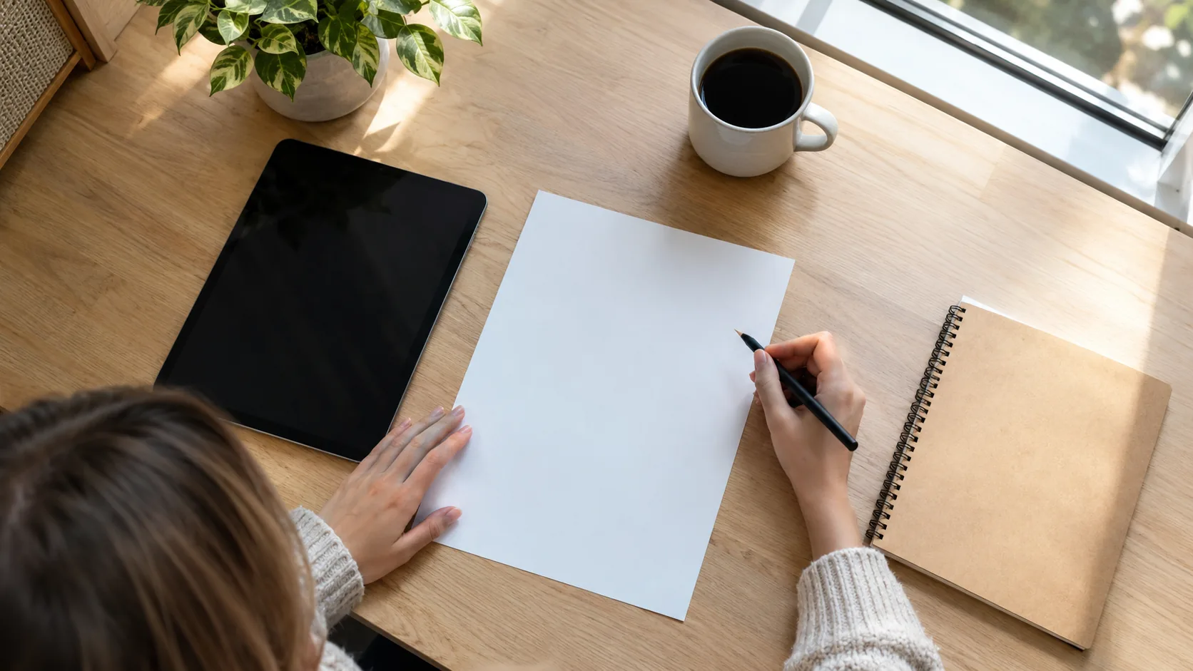
In a 10 inch tablet vs A4 paper comparison, the tablet is smaller. A 10.1-inch 16:10 screen has an active area of about 136 x 218 mm (5.35 x 8.56 in) held upright, while an A4 sheet is 210 x 297 mm (8.27 x 11.69 in). The screen covers a bit under half of the page, and a full A4 PDF fits only when it is shrunk to roughly two thirds of its printed width.
The numbers below come from simple geometry, so you can check any tablet before you buy it.
10 inch tablet vs A4 paper: the actual dimensions
Tablet sizes are quoted as a screen diagonal, measured across the screen only, not the case or bezel. A 10.1-inch diagonal is 256.5 mm. What you can fill with a page depends on the shape of the screen, so the same diagonal gives different widths and heights.
| Surface (portrait) | Width x height, mm | Width x height, inches |
|---|---|---|
| A4 sheet | 210 x 297 | 8.27 x 11.69 |
| A5 sheet | 148 x 210 | 5.83 x 8.27 |
| 10.1-inch screen, 16:10 | 136 x 218 | 5.35 x 8.56 |
| 10.1-inch screen, 16:9 | 126 x 224 | 4.95 x 8.80 |
| 10.1-inch screen, 4:3 | 154 x 205 | 6.06 x 8.08 |
| 13-inch screen, 4:3 | 198 x 264 | 7.80 x 10.40 |
All screen figures are rounded and assume the whole panel is the active area. Check the maker's listed screen dimensions when they are given.
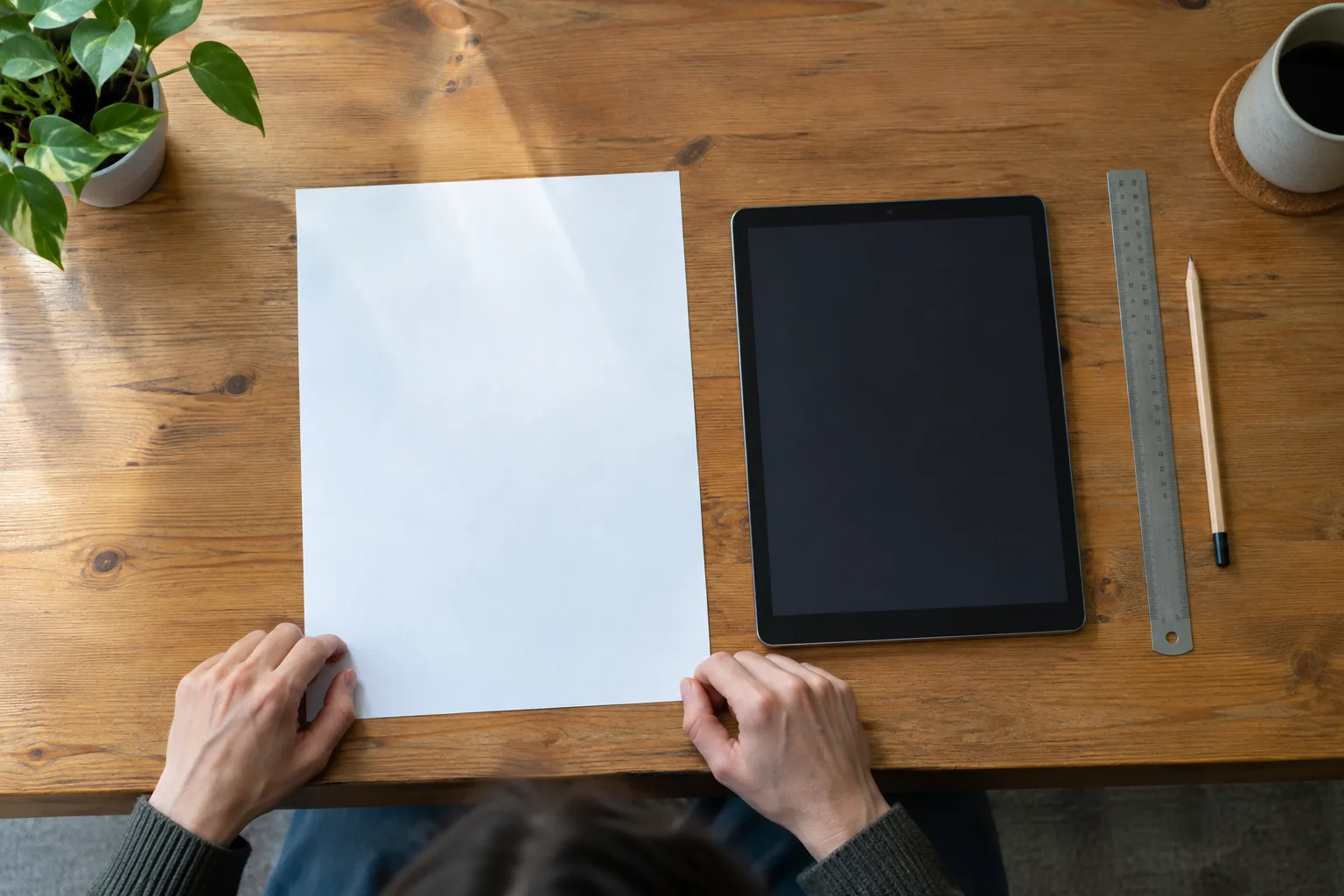
Why the diagonal misleads
Two tablets can both be called 10-inch and still differ in width by about 28 mm, as the 16:9 and 4:3 rows above show. A 4:3 screen is closer to the proportions of paper, while a 16:9 screen is long and narrow. The closer the shape is to A4's 1:1.41 ratio, the less empty margin appears when a page is displayed.
Resolution does not change the physical size. It sets how many pixels fill that area, which affects how crisp text looks, but a page still occupies the same width in millimeters. If you are looking at a listing, read the dimensions of the display, not the pixel count, to judge page size.
Quick scale check
Divide the screen width by 210 mm to get the scale of an A4 page fitted to width. A 136 mm screen gives about 0.65, a 154 mm screen about 0.73 and a 198 mm screen about 0.94. Multiply your document's font size by that number to see its apparent size, so 11 pt body text looks like roughly 7 pt, 8 pt or 10 pt.
Reading full-page PDFs
PDFs are laid out for a fixed page, so a smaller screen shrinks the whole page. On a 16:10 screen, 11 pt text shows at about 7 pt when the page is fitted to width. You can zoom in, but then you pan around and the layout no longer sits in one view.
Reflowable files behave differently. EPUB and similar formats rewrap text to the screen, so a small display holds them without shrinking anything. That is why reflowable books suit small screens, while scanned documents, forms and academic papers are the hard case.
For long text, the VerseTide is a book reading tablet with a 5.8-inch E-ink screen that opens PDF, EPUB, TXT, FB2, MOBI and HTML files. It weighs 170g and is 8mm thin. At 5.8 inches it is far smaller than A4, so it fits novels and reflowable files, not full-page layouts. You can browse similar devices in the E-Readers & Reading Tablets collection.
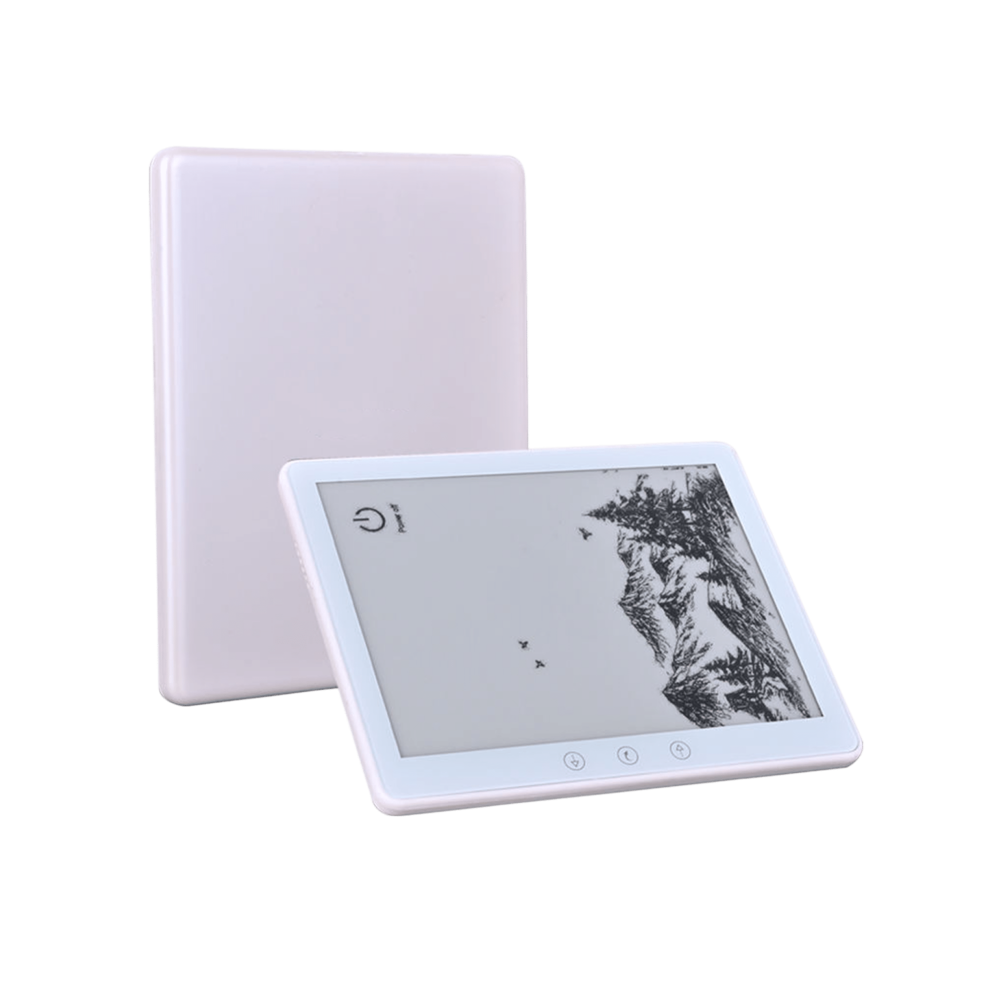 In this guideVerseTide$189.99View
Writing notes by hand
Handwriting works at a different scale from reading. Note-taking does not need a full A4 page, and an A5-size area is a familiar notebook format. A 4:3 10-inch screen is close to A5 in width and height, so it can hold a page of notes at roughly life size. A 16:10 screen is narrower, which leaves you writing in a tall strip.
If you like paper, a hybrid keeps the page you write on. The InkSync Pro takes an A5 notebook under 10mm thick on its textured surface. You write with the included smart pen, and strokes go over Bluetooth 5.0 to the companion app. It stores 50 pages offline, and notes can be exported as vector files or PDFs.
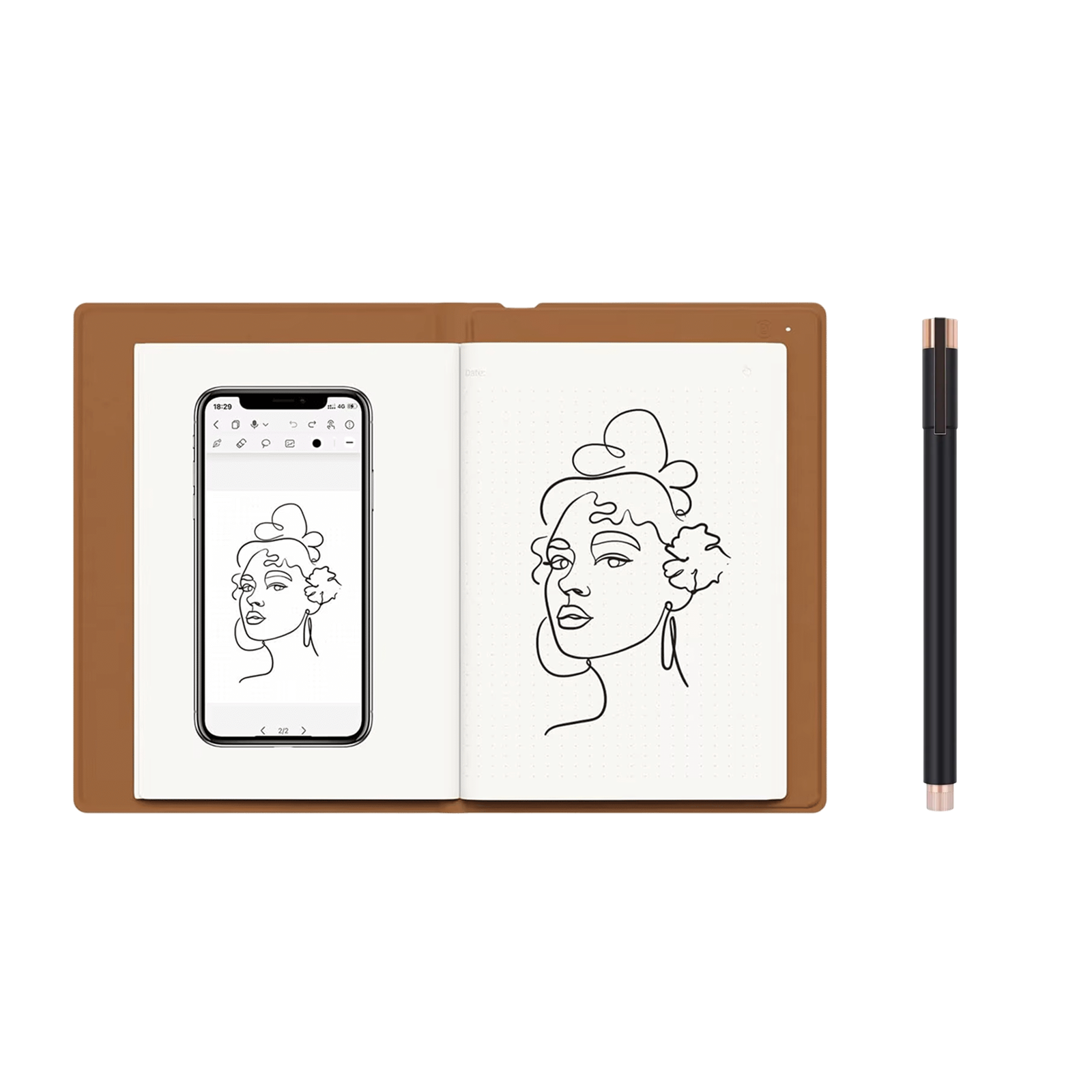 In this guideInkSync Pro$239.99View
For a wider comparison of note-taking formats, see the writing tablet guide, which sets e-ink notebooks, smart pens and LCD pads side by side.
Drawing and sketching
Drawing is about the working area under your hand, not the screen diagonal. A screen of 136 mm by 218 mm gives you a canvas you can cover with a wrist and forearm movement. A larger A4-size area asks for bigger arm movements, which suits loose sketching, while a smaller area suits detail.
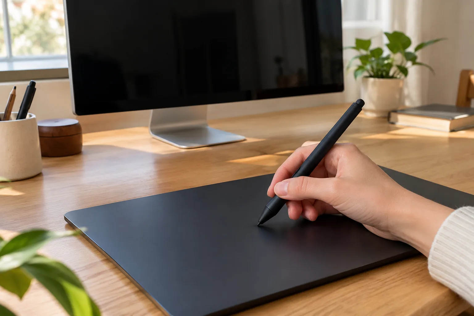
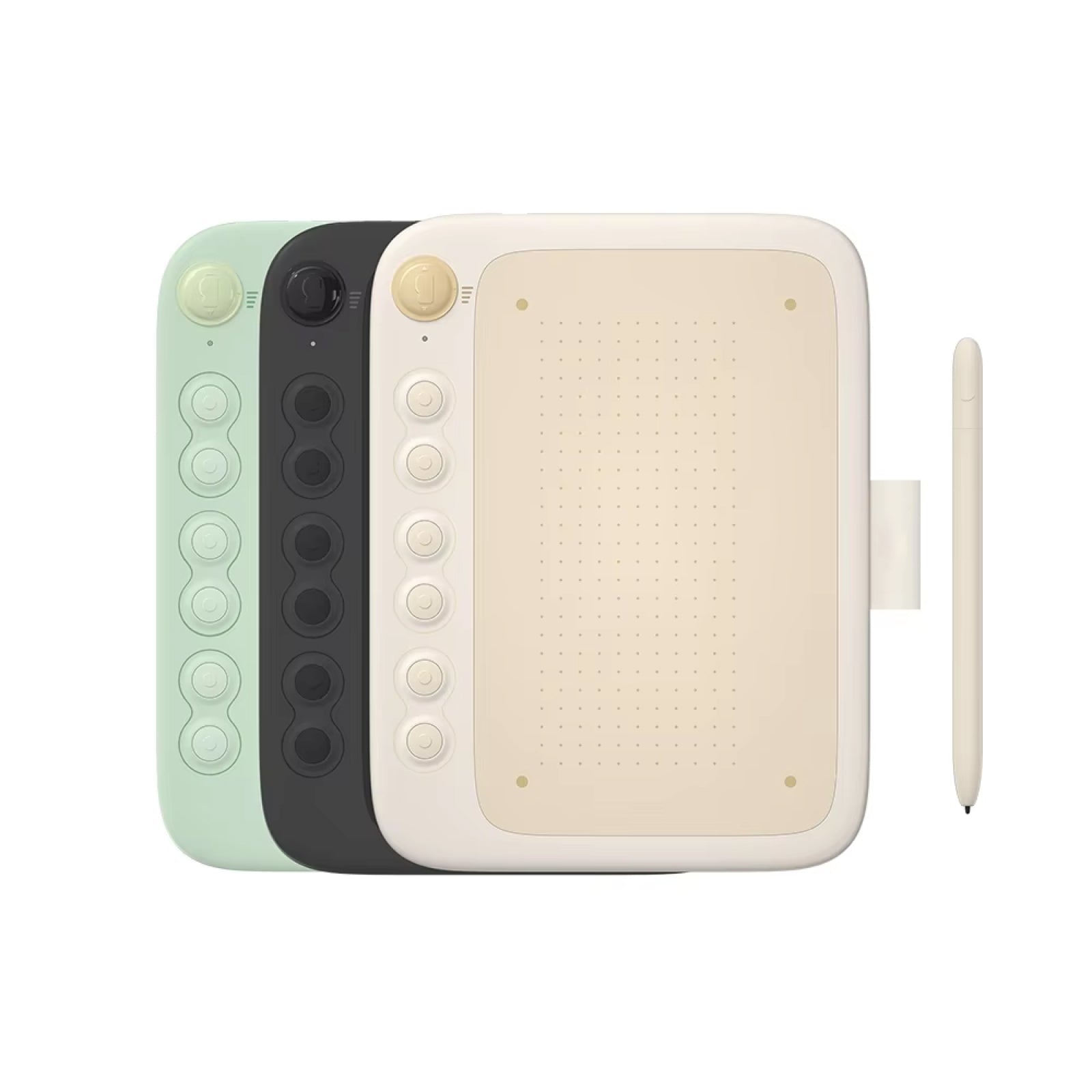
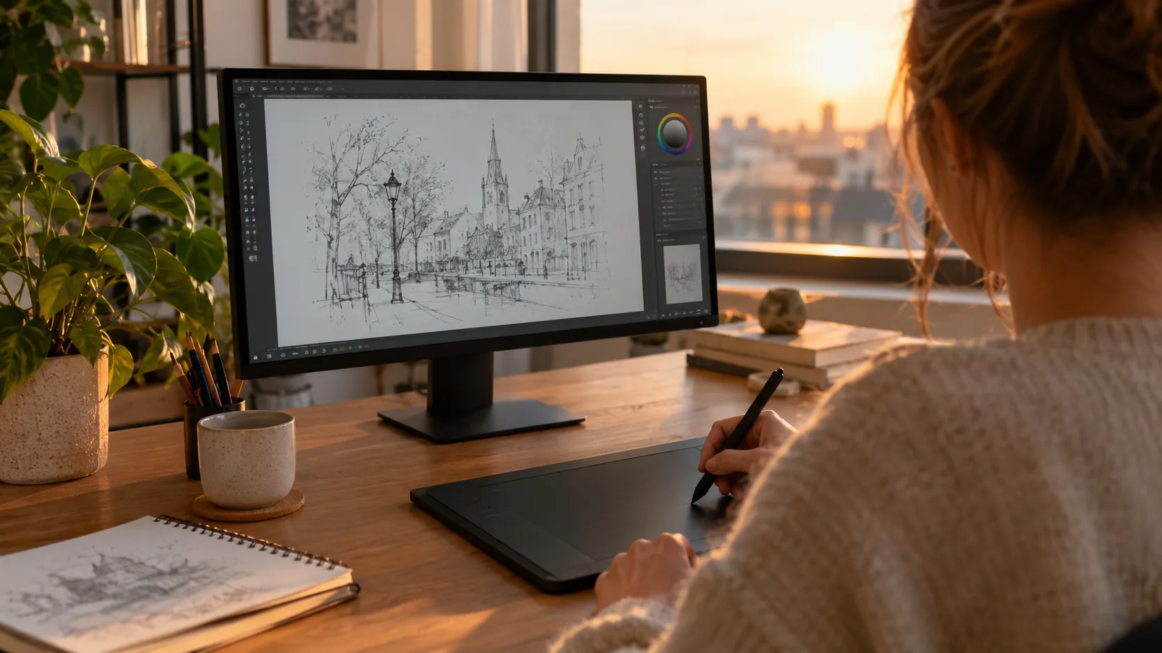
A screenless drawing tablet separates the two jobs: the pen surface is on the desk and the image appears on your computer monitor. The CanvaForge connects to a computer by USB and has an anti-glare drawing surface, a battery-free stylus with 8192 pressure levels and six programmable express keys. Compare its listed active area, if one is given, with the table above.
 In this guideCanvaForge$139.99View
If you are new to the format, the beginner's setup and practice guide covers connecting the tablet and mapping the express keys. You can also browse the digital notebooks and drawing tablets collection.
Size decision table
For a 10 inch tablet vs A4 paper decision, match the job to the area you need, then check the screen's real width.
| Main job | Area to look for | What to check |
|---|---|---|
| Full-page A4 PDFs, forms, papers | Width near 200 mm or more | 13-inch 4:3 class screens fit width at about 0.94 scale |
| Novels and reflowable files | Any size, including 5.8 inches | Supported file types and text size settings |
| Handwritten notes | About A5: 148 x 210 mm | 4:3 shape, or an A5 notebook surface |
| Sketching | Area that suits your arm movement | Active area of the pen surface, not the diagonal |
| Carrying everywhere | 10 inches or smaller | Weight and thickness |
Case fit and other size questions
A tablet sold as 10-inch has outer dimensions larger than its screen, because the bezel adds several millimeters on each side. A 10.1-inch case is made for tablets with that body size, so a 10-inch tablet fits only if its outer width, height and thickness match the case listing. Compare the millimeter dimensions, and check camera and button cutouts.
A 20-inch screen is closer to a small monitor than a tablet. At 16:10 it measures about 431 x 269 mm (17.0 x 10.6 in) in landscape, larger than an A4 sheet on its side.
Common mistakes when sizing up
- Comparing diagonals instead of widths. Two 10-inch screens can differ in width by about 28 mm, as 16:9 and 4:3 do.
- Expecting a PDF to fill the screen. Aspect ratio leaves bars at the top, bottom or sides.
- Ignoring the bezel when buying a case. Match outer dimensions to the case listing.
- Buying for resolution. Pixels do not add physical page area.
- Choosing one device for every job. Reading, writing and drawing each have a different ideal area.
Field note
Print an A4 page, lay a ruler across a tablet screen's listed width and fold the paper to that width. You will see how much of the page fits before you buy.
Frequently asked questions
Keep reading
 E-Readers & Reading TabletsEbook Reader Colour vs Black and White: Which Screen Suits You6 min read
 Digital Notebooks & Drawing TabletsWriting Tablet Guide: E-Ink vs Smart Pens vs LCD Pads7 min read
 Digital Notebooks & Drawing TabletsDrawing on a Drawing Tablet: A Beginner's Setup and Practice Guide9 min read